

Displays
The ways a recommendation can look on your storefront, what each one is good at, and the settings they share.
A display decides how a block looks. It never decides which products appear: switch a grid to a list and the shopper sees the same products in a different layout. You choose one per recommendation under Display Style, in the Design step.
| Display | What it is | Products | Tier |
|---|---|---|---|
| Grid | Cards side by side, on the page | 1–20 | Free |
| Inline list | Cards as rows, on the page | 1–20 | Free |
| Bundle box | Products sold together as one offer | at least 2 | Pro |
| Single-offer card | One product, as a yes/no question | exactly 1 | Pro |
| Popup | An overlay that opens on a trigger | 1–20 | Pro |
The first four sit at a spot on the page, chosen with Position On Page in the Setup step. The popup doesn't have a spot. It opens over the page when its trigger fires.
Grid
The default. Product cards side by side under your heading, each with an image, name, price and WooCommerce's own add-to-cart button.
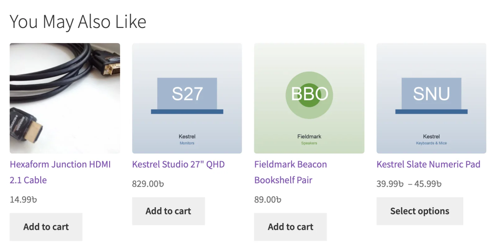
Best for: related products, "you may also like", and anywhere with the full page width, like below the product tabs or on a category page.
Columns: 4 on desktop, 3 on tablet and 2 on mobile, unless you change them.
Inline list
The same cards laid out as rows: the image on the left, the name and price beside it, and the button on the right.
Best for: narrow spaces, especially the cart. Four cards squeezed in beside the cart totals look cramped, while rows read naturally.
It shows exactly the same products a grid would, so switching between the two is a safe experiment.
Bundle box Pro
Products presented as one combined offer: the items joined by + signs, a Bundle total: and a single Add bundle to cart button.
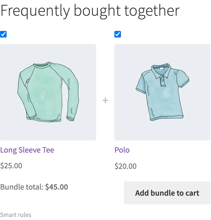
Best for: the classic Frequently bought together offer near the add-to-cart button. It works because it's one decision for the shopper instead of three.
Things to know:
- It needs at least 2 products. If fewer are available when the page loads, the block doesn't show at all. You'll never get a bundle of one, and the shopper never sees an error. In the builder, the card says Needs 2+ products when your current settings can't supply enough.
- Only simple products go in a bundle. One button can't add a product that needs a size or colour chosen first, so variable and other non-simple products are left out. If that leaves fewer than two, the block doesn't show.
- Let Shoppers Uncheck Items is on by default. Each item gets a checkbox, and the total updates as items are unchecked. Turn it off and the bundle is all-or-nothing.
- The "was" price is real or it isn't there. A crossed-out total only appears when the items genuinely have sale prices. The plugin doesn't invent a bundle discount, because it doesn't apply one.
Single-offer card Pro
One product, presented as a decision: image, name, price and two actions, Yes, add it and No thanks.

Best for: the post-purchase offer on the thank-you page, and anywhere a focused question works better than a grid to browse.
Things to know:
- Always exactly one product. There's no Products to Show setting for it.
- Yes, add it only appears for a simple product. Anything else gets a Choose options link that takes the shopper to the product.
- "No thanks" hides the card for that page only. It doesn't stop the card appearing on a later page.
- On the thank-you page, once the shopper adds the product, the card offers a Check out link and explains that the first order is already complete and this starts a new one.
Popup Pro
The recommendation opens in a dialog over the page. The shopper can always close it with the close button, by clicking outside it, or with the Escape key.
Best for: a single, well-timed offer, such as the Upsell Popup starting template on the checkout page.
Instead of a position on the page, a popup has two settings of its own, set in the Design step:
| Setting | What it does |
|---|---|
| Trigger Event | When it opens: On Page Load (after a delay of 0–10 seconds, default 3), On Exit Intent, On Add To Cart, or When Cart Value Reached (an amount in your store's base currency, default 50). |
| Fires On | "The pages this overlay may open on. Choose at least one." The pages offered depend on the recommendation's context: a Cart recommendation can fire on Cart, Checkout or Any page, for example. |
Not every trigger suits every context. On Add To Cart is only offered for Product and Cart recommendations, and When Cart Value Reached only for Cart and Thank You. A trigger that doesn't fit is greyed out with Not available on this page.
Things to know:
- A closed popup stays closed for the rest of the day for that shopper, on every page.
- It's coordinated like any other block. It counts towards Blocks per page and Recommendations per session in the Recommendation Manager, but it never competes for a location, because it doesn't have one.
- It defaults to 1 product, and you can raise it. Its columns default to 2 on desktop and tablet and 1 on mobile.
Settings every display shares
You set these in the Design step.
| Setting | Range | Default | Notes |
|---|---|---|---|
| Heading Shown to Shoppers | free text | "You may also like" | Leave it empty and the block shows no heading at all |
| Products to Show | 1–20 | 4 (popup: 1) | Not shown for the single-offer card, which is always 1 |
| Columns, desktop | 1–6 | 4 | Grid, inline list and popup only |
| Columns, tablet | 1–4 | 3 | |
| Columns, mobile | 1–2 | 2 |
The Recommendation Manager has a fixed ceiling of 20 products per block, the same as the top of the slider, so what you set is what you get.
What shoppers see on each card
Every display draws its products through the same card, so they behave consistently:
- Prices use WooCommerce's own price formatting, so price ranges show as ranges and your currency settings are respected.
- Buttons follow WooCommerce's rules: a simple product gets add to cart, a variable product gets a link to choose options, and an external product links out.
Products a shopper can't buy are removed before anything is drawn: unpublished products, products hidden from the catalogue, products that can't be purchased, and out-of-stock products (following your store's own stock-visibility setting). If removing them takes a bundle below two products, the block doesn't show rather than showing broken.
Styling
Blocks pick up your theme's look by default, and everything can be changed with CSS. Every element has a stable class, such as .sprcm-block, .sprcm-grid and .sprcm-card, and you can override the templates from your theme.
Full reference: Templates & CSS.
Not in this release
Carousel (Free), and the Slide-in and Mini-cart panel overlays (Pro), are planned but not offered by the builder yet. See Free vs Pro.
Next
- Locations: where to put each one.
- Design step: the settings in context.
- Templates & CSS: changing the markup.