

Design
How the block looks: its display style, heading, columns and number of products — and, for a popup, what opens it.
Setup decided which products appear and where. The Design tab decides what shoppers actually see. Nothing here changes which products are picked — switch from a grid to a list and the same products are re-drawn in a different layout. The Live Preview updates as you go, so the quickest way to work on this tab is to watch the right-hand pane.
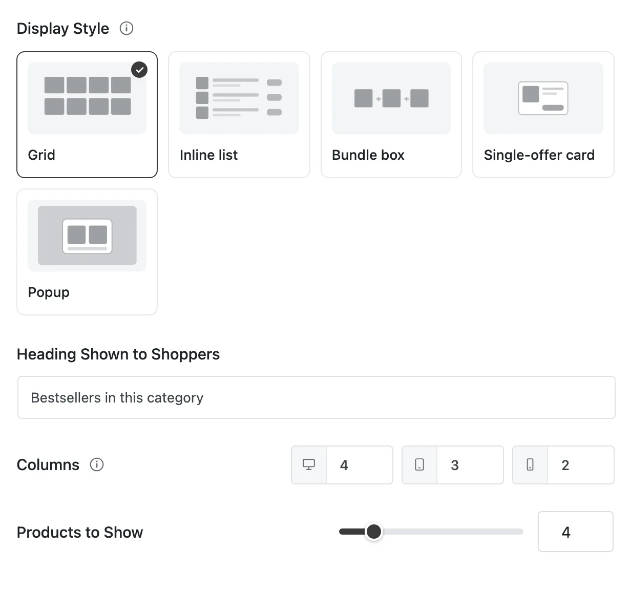
Display Style
"Inline displays sit at a page hook; popup & slide-in are overlays with a trigger. The display never changes what is recommended."
Pick a card. The selected one has a dark border and a check mark.
| Display | What it is | Products | Tier |
|---|---|---|---|
| Grid | Product cards side by side in a responsive grid. The default | 1 or more | Free |
| Inline list | The same cards as horizontal rows. Better in narrow spaces like the cart | 1 or more | Free |
| Bundle box | Products shown as one combined offer with a running total and one add-to-cart button | 2 or more | Pro |
| Single-offer card | Exactly one product with Yes, add it / No thanks | Exactly 1 | Pro |
| Popup | An overlay that opens on top of the page when a trigger fires | 1 or more | Pro |
In the free plugin, the Pro cards show a Pro badge; clicking one explains what Pro adds instead of selecting it.
A display that can't be filled is hidden, never broken. A bundle box needs at least two products. If your current settings would give it fewer, its card is dimmed with "Needs 2+ products", and if you pick it anyway the builder warns: "This display needs 2 products and the current configuration yields fewer, so it would be suppressed." On the storefront the same thing happens quietly — no error, no half-drawn box.
More on what each one looks like: Displays.
Popup triggers Pro
A popup isn't placed at a spot on the page — it opens over the page when something happens. So when you choose Popup, the Position On Page row disappears from Setup, and three settings appear here instead.
Fires On
"The pages this overlay may open on. Choose at least one." What you can tick depends on the page you chose under Show On:
| Show On | Fires On choices |
|---|---|
| Product | Product pages · Any page |
| Category | Category pages · Product pages · Any page |
| Cart | Cart · Checkout · Any page |
| Thank You | Thank-you page |
| Anywhere | Shop · Product pages · Category pages · Cart · Checkout · Thank-you page · Any page |
Trigger Event
| Trigger | When it opens | Setting | Available for |
|---|---|---|---|
| On Page Load | A few seconds after the page loads | After — 0 to 10 seconds, default 3 | Every page |
| On Exit Intent | When the shopper looks like they're about to leave | — | Product, Category, Cart, Anywhere |
| On Add To Cart | When the shopper adds something to the cart | — | Product, Cart |
| When Cart Value Reached | When the cart total reaches an amount | Amount, "In your store's base currency." Default 50 | Cart, Thank You |
Triggers that don't fit your page show as "Not available on this page." If you change Show On later and the trigger no longer fits, it's cleared, and the popup can't go live until you choose another.
Heading Shown to Shoppers
The title above the block — the first thing a shopper reads. It's worth writing for every Recommendation: "Frequently bought together" and "You may also like" set very different expectations.
Leave it empty and shoppers see the default heading, and the builder reminds you: "This placement has no heading, so shoppers will see the default one."
Display settings
Columns
"How many products sit side by side on each screen size." Three boxes — desktop, tablet and mobile — shown for Grid, Inline list and Popup.
| Device | Range | Default (Grid, Inline list) | Default (Popup) |
|---|---|---|---|
| Desktop | 1–6 | 4 | 2 |
| Tablet | 1–4 | 3 | 2 |
| Mobile | 1–2 | 2 | 1 |
Columns are free to change on every store. Use the Desktop / Mobile switch in the preview to check the result — the mobile frame is narrow enough to use your mobile setting.
Products to Show
A slider from 1 to 20, default 4. It's a ceiling, not a promise: if fewer products qualify, fewer show.
The Single-offer card always shows exactly one product, so this slider is hidden for it.
Let Shoppers Uncheck Items
Bundle box only, on by default. When it's on, each item in the bundle has a checkbox and the total updates as shoppers untick items. Turn it off to make the bundle all-or-nothing.
When two blocks want the same spot
Only one block renders in each position. If another Recommendation targets the same spot, the Recommendation Manager picks one, and the preview tells you before you save — "Another placement wins this location." The full list of preview messages is on The Builder.
Next
- Display Conditions — limit who sees the block, and when.
- Displays · Locations
- Shortcode & Block